For over a decade I have been in love with photography and especially photographing London, its people, architecture, landscape and street art.
Over the years I’ve been receiving many enquiries from interior designers to purchase my London photography for home decor or offices. My work is featured in many private international collections and hotels such as the Hoxton Hotel in London as well as W Barcelona have exhibited it.
However I have discovered with experience that not all photography is well suited for interiors and shooting with a purpose will help other photographers be successful.
So what makes for attractive London photography for home decor? What can you do as a photographer to increase your chances of attracting buyers?
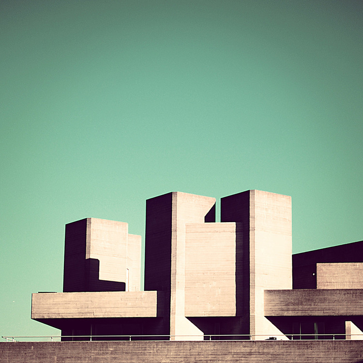
Let’s look at a real world example, Minimal London, my most popular series of urban photos of London for interiors.
What makes this my top seller?
- Minimalism
- Colour
- Square format
Minimalism:
Minimal photography and the use of negative space in urban photography are attractive. Less is more. It leaves the viewer guessing where this was shot, it also allows the viewer to look at a famous London landmark in a different way, something they may not have thought of themselves. Can you guess where each of the above images were shot? It beats more conventional views of London (dare I say cliché?) that often are too busy to make for good wall art.
Colour:
The choice of Aqua as a colour theme is also attractive and deliberate on my part. In colour psychology it is established that certain colours evoke a specific mood and Aqua is no exception.
Aqua is a mix of blue and green and its psychological effect is a mix of the two. It is a popular colour that a majority of people enjoy. Aqua promotes calmness and peace. It also encourages cleanliness and is linked to clear thinking and thoughtfulness.
Aqua is not an aggressive colour such as red for example.
Square Format:
Contrary to popular belief, the square format did not make its first appearance on Instagram (although it made it popular), in fact it is as old as photography itself. I own a very special vintage 1938 Rolleicord “art deco” which is a medium format and shoots square images.
But why do people choose to shoot in square format in the first place?
I think it comes mostly from simplifying things, square is somehow more aesthetically pleasing and in the case of this minimal urban series I think was the obvious choice. For photographers, square images are a way to challenge themselves if all they do is shoot portrait or landscape. An exercise I recommend highly.
What do you think makes for great interior décor photography? Leave your comment here or contact me directly!
Nico


